7 Qc Tools 304mf
This document was ed by and they confirmed that they have the permission to share it. If you are author or own the copyright of this book, please report to us by using this report form. Report 2z6p3t
Overview 5o1f4z
& View 7 Qc Tools as PDF for free.
More details 6z3438
- Words: 2,003
- Pages: 43
Quality Tools PROBLEM SOLVING
Quality Improvement: Problem Solving
Quality Improvement: Problem Solving
Quality management activities Quality assurance
Establish organisational procedures and standards for quality.
Quality planning
Select applicable procedures and standards for a particular project and modify these as required.
Quality control
Ensure that procedures and standards are followed by the software development team.
Quality management should be separate from project
management to ensure independence.
Six Problem Solving Steps Identify
recognize the symptoms
Define
Agree on the problem and set boundaries
Investigate
Collect data
Analyze
Use quality tools to aid
Solve
Develop the solution and implement
Confirm
Follow up to ensure that the solution is effective
Quality Control Tools
Pareto chart Histogram Process flow diagram Check sheet Scatter diagram Control chart Run chart Cause and effect diagram
Quality Improvement: Problem Solving
Pareto Principle Vilfredo Pareto (1848-1923) Italian economist
20% of the population has 80% of the wealth
Juran used the term “vital few, trivial many”. He
noted that 20% of the quality problems caused 80% of the dollar loss.
7 Quality Tools Quality Improvement: Problem Solving
Purpose: Prioritize problems.
How is it done? Create a preliminary list of
problem classifications. Tally the occurrences in each problem classification. Arrange each classification in order from highest to lowest Construct the bar chart
Pareto Charts
Pareto Charts Benefits:
Pareto analysis helps graphically display results so the significant few problems emerge from the general background It tells you what to work on first
Pareto chart
% Complaints
7 Quality Tools Quality Improvement: Problem Solving
g
Quality Improvement: Problem Solving
hi ne
ca
pa
rt s
ns
0
O
(13)
l pe ibra ti o ra to r e ns rro De rs fe ct ive m Su at r fa er ia ce ls ab ra sio ns
M ac
tiv e
20
sio
30
ec
ig n
40
en
es
50
di m
rD
60
De f
W ro n
Po o
70
Percent from each cause
Pareto (64) Chart
(10)
10 (6) (3)
Causes of poor quality
(2) (2)
Histograms What is it?
LSL
USL
• A Histogram is a bar graph • usually used to present frequency data
How does it Work? • • • • •
Define Categories for Data Collect Data, sort them into the categories Count the Data for each category Draw the Diagram. each category finds its place on the x-Axis. The bars will be as high as the value for the category
What is its use? • Histograms provide an easy way to evaluate the distribution of Data over different categories
11
Histograms Example: take the failure rate of a machine over a period of x weeks. Now Assign every week the number of failures that occurred. Draw the Histogram. Let the bar represent the weeks. The height of the Bar on the y-axis is the number of failures that occurred during that week.
LSL
USL
12
Flow Diagrams " Draw a flowchart for whatever you do. Until you do, you do not know what you are doing, you just have a job.” -- Dr. W. Edwards Deming.
Quality Improvement: Problem Solving
Flowcharts Flowcharts
Graphical description of how work is done. Used to describe processes that are to be improved.
7 Quality Tools Quality Improvement: Problem Solving
Purpose:
Flow Charts
Visual illustration of the sequence of operations required to complete a task
Schematic drawing of the process to measure or improve. Starting point for process improvement Potential weakness in the process are made visual. Picture of process as it should be.
Benefits:
Identify process improvements Understand the process Shows duplicated effort and other non-value-added steps Clarify working relationships between people and organizations Target specific steps in the process for improvement.
Benefits
Flow charts Linear
Show what actually happens
at each step in the process Show what happens when non-standard events occur Graphically display processes to identify redundancies and other wasted effort
How is it done? Write the process step inside
each symbol Connect the Symbols with arrows showing the direction of flow
Toolbox
Flow Diagrams
Quality Improvement: Problem Solving
Flow Diagrams
Quality Improvement: Problem Solving
Process: Apple Sauce Description of process
Time (min)
Analyst: TLR Operation Transport Inspect Delay Storage
Location: Graves Mountain
Step
Date: 9-30-00
1
Unload apples from truck
2
Move to inspection station
3
Weigh, inspect, sort
4
Move to storage
5
Wait until needed
6
Move to peeler
7
Apples peeled and cored
15
8
Soak in water until needed
20
9
Place in conveyor
5
Move to mixing area
11
Weigh, inspect, sort
Quality Improvement: Problem Solving
20 100 ft 30 50 ft 360 20 ft
10 Page 1 0f 3
Distance (feet)
Process Chart
Total
20 ft 30 480
190 ft
Quality Improvement: Problem Solving
Check Sheet
Defect Type
Shifts
7 Quality Tools
Quality Improvement: Problem Solving
Purpose: Tool
for collecting and organizing measured or counted data Data collected can be used as input data for other quality tools
Benefits: Collect
data in a systematic and organized manner To determine source of problem To facilitate classification of data (stratification)
Checksheets
Check Sheet COMPONENTS REPLACED BY LAB TIME PERIOD: 22 Feb to 27 Feb 1998 REPAIR TECHNICIAN: Bob TV SET MODEL 1013
Integrated Circuits Capacitors Resistors Transformers Commands CRT Quality Improvement: Problem Solving
|||| |||| |||| |||| |||| |||| || || |||| |
Cause-and-Effect Diagrams Show the relationships between a problem and its
possible causes. Developed by Kaoru Ishikawa (1953) Also known as …
Fishbone diagrams Ishikawa diagrams
7 Quality Tools Quality Improvement: Problem Solving
Cause and Effect “Skeleton”
Materials
Procedures
Quality Problem
People
Equipment 7 Quality Tools
Quality Improvement: Problem Solving
Fishbone Diagram Purpose: Graphical representation of the trail leading to the root cause of a problem
How is it done? • Decide which quality characteristic, outcome or effect you want to examine (may use Pareto chart) • Backbone –draw straight line • Ribs – categories • Medium size bones – secondary causes • Small bones – root causes
Cause & Effect Diagrams
Benefits: Breaks problems down into bite-size pieces to find root
cause Fosters team work Common understanding of factors causing the problem Road map to picture of the process Follows brainstorming relationship
Fishbone Diagram Measurement Faulty testing equipment Incorrect specifications
Human
Inaccurate temperature control Dust and Dirt
Environment
Out of adjustment
Poor supervision Lack of concentration
Improper methods
Machines
Tooling problems Old / worn
Inadequate training
Quality Problem Defective from vendor Not to specifications Materialhandling problems
Materials
Quality Improvement: Problem Solving
Poor process design Ineffective quality management Deficiencies in product design
Process
Cause & Effect Diagrams Sample Materials
Manpower Typos
Source info incorrect Didn’t follow proc.
Wrong source info
t or Po
Wrong purchase order
i ra
Dyslexic Transposition
ni ng
Incorrect shipping documents
Glare on display
Temp. Environme nt
Corrupt data
No training
No communications
No procedure
Keyboard sticks
Software problem Methods
Machine
Cause and effect diagrams Advantages
making the diagram is educational in itself diagram demonstrates knowledge of problem solving team diagram results in active searches for causes diagram is a guide for data collection
Quality Improvement: Problem Solving
Cause and effect diagrams To construct the skeleton, : For manufacturing - the 4 M’s
man, method, machine, material
For service applications
equipment, policies, procedures, people
Quality Improvement: Problem Solving
Quality Control Tool
Control Charts
Control Charts Purpose: The primary purpose of a control chart is to predict expected product outcome.
Benefits: Predict process out of control and out of
specification limits Distinguish between specific, identifiable causes of variation Can be used for statistical process control
Control Charts Strategy for eliminating assignable-cause variation:
Get timely data so that you see the effect of the assignable cause soon after it occurs. As soon as you see something that indicates that an assignable cause of variation has happened, search for the cause. Change tools to compensate for the assignable cause. Strategy for reducing common-cause variation: Do not attempt to explain the difference between any of the values or data points produced by a stable system in control. Reducing common-cause variation usually requires making fundamental changes in your process
Control Charts Control Chart Decision Tree
Determine Sample size (n)
Variable or Attribute Data
Variable is measured on a continuous scale
Attribute is occurrences in n observations
Determine if sample size is constant or changing
Scatter Diagrams What is it? • Statistical tool showing a trend in a series of values.
How does it Work? • Gain values series • Draw graph with value points • Draw trend line: m*x+a » Calculate m value » Calculate a value » Calculate points for trend line.
Y
X
What is its use? • Demonstrating correlations between values and showing trends for value changes.
12/09/15
37
Scatter Diagrams Purpose: To identify the correlations that might exist between a quality characteristic and a factor that might be driving it • A scatter diagram shows the correlation between two variables in a process. – These variables could be a Critical To Quality (CTQ) characteristic and a factor affecting it two factors affecting a CTQ or two related quality characteristics. • Dots representing data points are scattered on the diagram. – The extent to which the dots cluster together in a line across the diagram shows the strength with which the two factors are related.
•
If the variables are correlated, when one changes the other probably also changes.
•
Dots that look like they are trying to form a line are strongly correlated.
•
Sometimes the scatter plot may show little correlation when all the data are considered at once. Stratifying the data, that is, breaking it into two or more groups based on some difference such as the equipment used, the time of day, some variation in materials or differences in the people involved, may show surprising results
Scatter Diagrams
Scatter Diagrams How is it done?: • Decide which paired factors you want to examine. Both factors must be measurable on some incremental linear scale. • Collect 30 to 100 paired data points. • Find the highest and lowest value for both variables. • Draw the vertical (y) and horizontal (x) axes of a graph. • Plot the data • Title the diagram The shape that the cluster of dots takes will tell you something about the relationship between the two variables that you tested.
What is it? • Run Charts are representing change • in measurement over a sequence or time
Measurement
Run Charts Time
How does it Work? • Gather Data • Organize Data » Measurements (y) must be confronted with time or sequence of the events.
• Chart Data • Interpreting Data
What is its use? • Determining Cyclic Events and there average character
12/09/15
41
What does it look like? o Adding the element of time will help clarify your understanding of the causes of variation in the processes. o A run chart is a line graph of data points organized in time sequence and centered on the median data value.
Control ChartsRun Charts
Run Charts Example
Measurement
• Oil consumption of a specific machine over a period of time.
12/09/15
Time
43
Control Charts What is it? • •
Y
Statistical tool, showing whether A process is in control or not
How does it Work? • • •
Upper limit
Define Upper limit, lower limit and medium value Draw Chart. Gather values and draw them into chart
Average/Spec Lower limit
X
What is its use? •
Taking samples of a process and detect possibility of process being out of control
12/09/15
44
Quality Improvement: Problem Solving
Quality Improvement: Problem Solving
Quality management activities Quality assurance
Establish organisational procedures and standards for quality.
Quality planning
Select applicable procedures and standards for a particular project and modify these as required.
Quality control
Ensure that procedures and standards are followed by the software development team.
Quality management should be separate from project
management to ensure independence.
Six Problem Solving Steps Identify
recognize the symptoms
Define
Agree on the problem and set boundaries
Investigate
Collect data
Analyze
Use quality tools to aid
Solve
Develop the solution and implement
Confirm
Follow up to ensure that the solution is effective
Quality Control Tools
Pareto chart Histogram Process flow diagram Check sheet Scatter diagram Control chart Run chart Cause and effect diagram
Quality Improvement: Problem Solving
Pareto Principle Vilfredo Pareto (1848-1923) Italian economist
20% of the population has 80% of the wealth
Juran used the term “vital few, trivial many”. He
noted that 20% of the quality problems caused 80% of the dollar loss.
7 Quality Tools Quality Improvement: Problem Solving
Purpose: Prioritize problems.
How is it done? Create a preliminary list of
problem classifications. Tally the occurrences in each problem classification. Arrange each classification in order from highest to lowest Construct the bar chart
Pareto Charts
Pareto Charts Benefits:
Pareto analysis helps graphically display results so the significant few problems emerge from the general background It tells you what to work on first
Pareto chart
% Complaints
7 Quality Tools Quality Improvement: Problem Solving
g
Quality Improvement: Problem Solving
hi ne
ca
pa
rt s
ns
0
O
(13)
l pe ibra ti o ra to r e ns rro De rs fe ct ive m Su at r fa er ia ce ls ab ra sio ns
M ac
tiv e
20
sio
30
ec
ig n
40
en
es
50
di m
rD
60
De f
W ro n
Po o
70
Percent from each cause
Pareto (64) Chart
(10)
10 (6) (3)
Causes of poor quality
(2) (2)
Histograms What is it?
LSL
USL
• A Histogram is a bar graph • usually used to present frequency data
How does it Work? • • • • •
Define Categories for Data Collect Data, sort them into the categories Count the Data for each category Draw the Diagram. each category finds its place on the x-Axis. The bars will be as high as the value for the category
What is its use? • Histograms provide an easy way to evaluate the distribution of Data over different categories
11
Histograms Example: take the failure rate of a machine over a period of x weeks. Now Assign every week the number of failures that occurred. Draw the Histogram. Let the bar represent the weeks. The height of the Bar on the y-axis is the number of failures that occurred during that week.
LSL
USL
12
Flow Diagrams " Draw a flowchart for whatever you do. Until you do, you do not know what you are doing, you just have a job.” -- Dr. W. Edwards Deming.
Quality Improvement: Problem Solving
Flowcharts Flowcharts
Graphical description of how work is done. Used to describe processes that are to be improved.
7 Quality Tools Quality Improvement: Problem Solving
Purpose:
Flow Charts
Visual illustration of the sequence of operations required to complete a task
Schematic drawing of the process to measure or improve. Starting point for process improvement Potential weakness in the process are made visual. Picture of process as it should be.
Benefits:
Identify process improvements Understand the process Shows duplicated effort and other non-value-added steps Clarify working relationships between people and organizations Target specific steps in the process for improvement.
Benefits
Flow charts Linear
Show what actually happens
at each step in the process Show what happens when non-standard events occur Graphically display processes to identify redundancies and other wasted effort
How is it done? Write the process step inside
each symbol Connect the Symbols with arrows showing the direction of flow
Toolbox
Flow Diagrams
Quality Improvement: Problem Solving
Flow Diagrams
Quality Improvement: Problem Solving
Process: Apple Sauce Description of process
Time (min)
Analyst: TLR Operation Transport Inspect Delay Storage
Location: Graves Mountain
Step
Date: 9-30-00
1
Unload apples from truck
2
Move to inspection station
3
Weigh, inspect, sort
4
Move to storage
5
Wait until needed
6
Move to peeler
7
Apples peeled and cored
15
8
Soak in water until needed
20
9
Place in conveyor
5
Move to mixing area
11
Weigh, inspect, sort
Quality Improvement: Problem Solving
20 100 ft 30 50 ft 360 20 ft
10 Page 1 0f 3
Distance (feet)
Process Chart
Total
20 ft 30 480
190 ft
Quality Improvement: Problem Solving
Check Sheet
Defect Type
Shifts
7 Quality Tools
Quality Improvement: Problem Solving
Purpose: Tool
for collecting and organizing measured or counted data Data collected can be used as input data for other quality tools
Benefits: Collect
data in a systematic and organized manner To determine source of problem To facilitate classification of data (stratification)
Checksheets
Check Sheet COMPONENTS REPLACED BY LAB TIME PERIOD: 22 Feb to 27 Feb 1998 REPAIR TECHNICIAN: Bob TV SET MODEL 1013
Integrated Circuits Capacitors Resistors Transformers Commands CRT Quality Improvement: Problem Solving
|||| |||| |||| |||| |||| |||| || || |||| |
Cause-and-Effect Diagrams Show the relationships between a problem and its
possible causes. Developed by Kaoru Ishikawa (1953) Also known as …
Fishbone diagrams Ishikawa diagrams
7 Quality Tools Quality Improvement: Problem Solving
Cause and Effect “Skeleton”
Materials
Procedures
Quality Problem
People
Equipment 7 Quality Tools
Quality Improvement: Problem Solving
Fishbone Diagram Purpose: Graphical representation of the trail leading to the root cause of a problem
How is it done? • Decide which quality characteristic, outcome or effect you want to examine (may use Pareto chart) • Backbone –draw straight line • Ribs – categories • Medium size bones – secondary causes • Small bones – root causes
Cause & Effect Diagrams
Benefits: Breaks problems down into bite-size pieces to find root
cause Fosters team work Common understanding of factors causing the problem Road map to picture of the process Follows brainstorming relationship
Fishbone Diagram Measurement Faulty testing equipment Incorrect specifications
Human
Inaccurate temperature control Dust and Dirt
Environment
Out of adjustment
Poor supervision Lack of concentration
Improper methods
Machines
Tooling problems Old / worn
Inadequate training
Quality Problem Defective from vendor Not to specifications Materialhandling problems
Materials
Quality Improvement: Problem Solving
Poor process design Ineffective quality management Deficiencies in product design
Process
Cause & Effect Diagrams Sample Materials
Manpower Typos
Source info incorrect Didn’t follow proc.
Wrong source info
t or Po
Wrong purchase order
i ra
Dyslexic Transposition
ni ng
Incorrect shipping documents
Glare on display
Temp. Environme nt
Corrupt data
No training
No communications
No procedure
Keyboard sticks
Software problem Methods
Machine
Cause and effect diagrams Advantages
making the diagram is educational in itself diagram demonstrates knowledge of problem solving team diagram results in active searches for causes diagram is a guide for data collection
Quality Improvement: Problem Solving
Cause and effect diagrams To construct the skeleton, : For manufacturing - the 4 M’s
man, method, machine, material
For service applications
equipment, policies, procedures, people
Quality Improvement: Problem Solving
Quality Control Tool
Control Charts
Control Charts Purpose: The primary purpose of a control chart is to predict expected product outcome.
Benefits: Predict process out of control and out of
specification limits Distinguish between specific, identifiable causes of variation Can be used for statistical process control
Control Charts Strategy for eliminating assignable-cause variation:
Get timely data so that you see the effect of the assignable cause soon after it occurs. As soon as you see something that indicates that an assignable cause of variation has happened, search for the cause. Change tools to compensate for the assignable cause. Strategy for reducing common-cause variation: Do not attempt to explain the difference between any of the values or data points produced by a stable system in control. Reducing common-cause variation usually requires making fundamental changes in your process
Control Charts Control Chart Decision Tree
Determine Sample size (n)
Variable or Attribute Data
Variable is measured on a continuous scale
Attribute is occurrences in n observations
Determine if sample size is constant or changing
Scatter Diagrams What is it? • Statistical tool showing a trend in a series of values.
How does it Work? • Gain values series • Draw graph with value points • Draw trend line: m*x+a » Calculate m value » Calculate a value » Calculate points for trend line.
Y
X
What is its use? • Demonstrating correlations between values and showing trends for value changes.
12/09/15
37
Scatter Diagrams Purpose: To identify the correlations that might exist between a quality characteristic and a factor that might be driving it • A scatter diagram shows the correlation between two variables in a process. – These variables could be a Critical To Quality (CTQ) characteristic and a factor affecting it two factors affecting a CTQ or two related quality characteristics. • Dots representing data points are scattered on the diagram. – The extent to which the dots cluster together in a line across the diagram shows the strength with which the two factors are related.
•
If the variables are correlated, when one changes the other probably also changes.
•
Dots that look like they are trying to form a line are strongly correlated.
•
Sometimes the scatter plot may show little correlation when all the data are considered at once. Stratifying the data, that is, breaking it into two or more groups based on some difference such as the equipment used, the time of day, some variation in materials or differences in the people involved, may show surprising results
Scatter Diagrams
Scatter Diagrams How is it done?: • Decide which paired factors you want to examine. Both factors must be measurable on some incremental linear scale. • Collect 30 to 100 paired data points. • Find the highest and lowest value for both variables. • Draw the vertical (y) and horizontal (x) axes of a graph. • Plot the data • Title the diagram The shape that the cluster of dots takes will tell you something about the relationship between the two variables that you tested.
What is it? • Run Charts are representing change • in measurement over a sequence or time
Measurement
Run Charts Time
How does it Work? • Gather Data • Organize Data » Measurements (y) must be confronted with time or sequence of the events.
• Chart Data • Interpreting Data
What is its use? • Determining Cyclic Events and there average character
12/09/15
41
What does it look like? o Adding the element of time will help clarify your understanding of the causes of variation in the processes. o A run chart is a line graph of data points organized in time sequence and centered on the median data value.
Control ChartsRun Charts
Run Charts Example
Measurement
• Oil consumption of a specific machine over a period of time.
12/09/15
Time
43
Control Charts What is it? • •
Y
Statistical tool, showing whether A process is in control or not
How does it Work? • • •
Upper limit
Define Upper limit, lower limit and medium value Draw Chart. Gather values and draw them into chart
Average/Spec Lower limit
X
What is its use? •
Taking samples of a process and detect possibility of process being out of control
12/09/15
44
Related Documents c2h70

7 Qc Tools Benefits 221pj
December 2019 131
New 7 Qc Tools 5l6q6k
August 2021 0
7 Qc Tools Presentation 6t5w6p
December 2019 99
7 Qc Tools 304mf
April 2022 0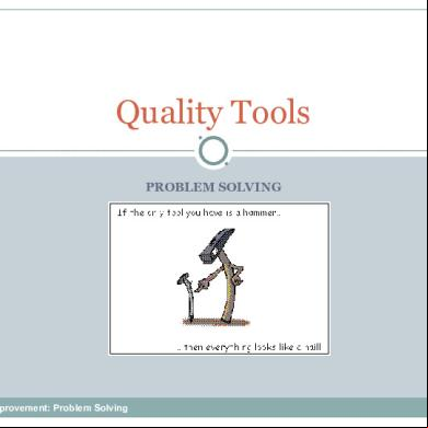
7 Qc Tools 304mf
August 2021 0
7 Qc Tools In Tamil 6o5w59
October 2019 727More Documents from "vsganesh" 3m5f5f